Just for fun
As if I don’t spend enough hours on these things at work, I also enjoy genomics and data visualization in my spare time. Here’s some examples of data visualizations I’ve created for the #30DayChartChallenge on Twitter.
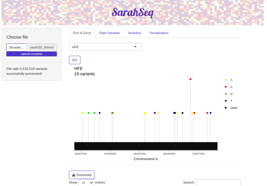
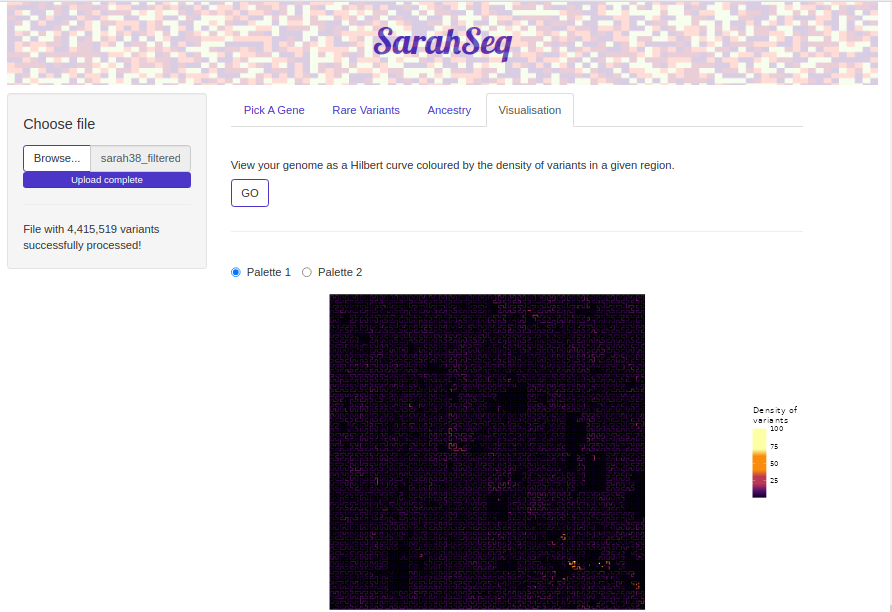
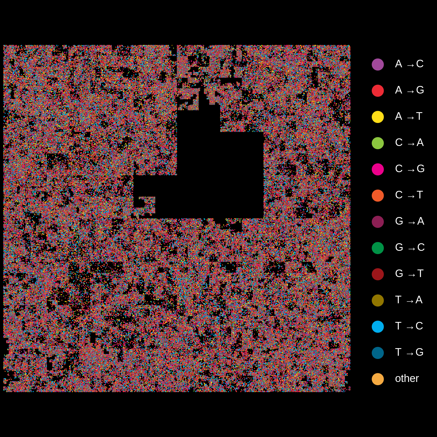
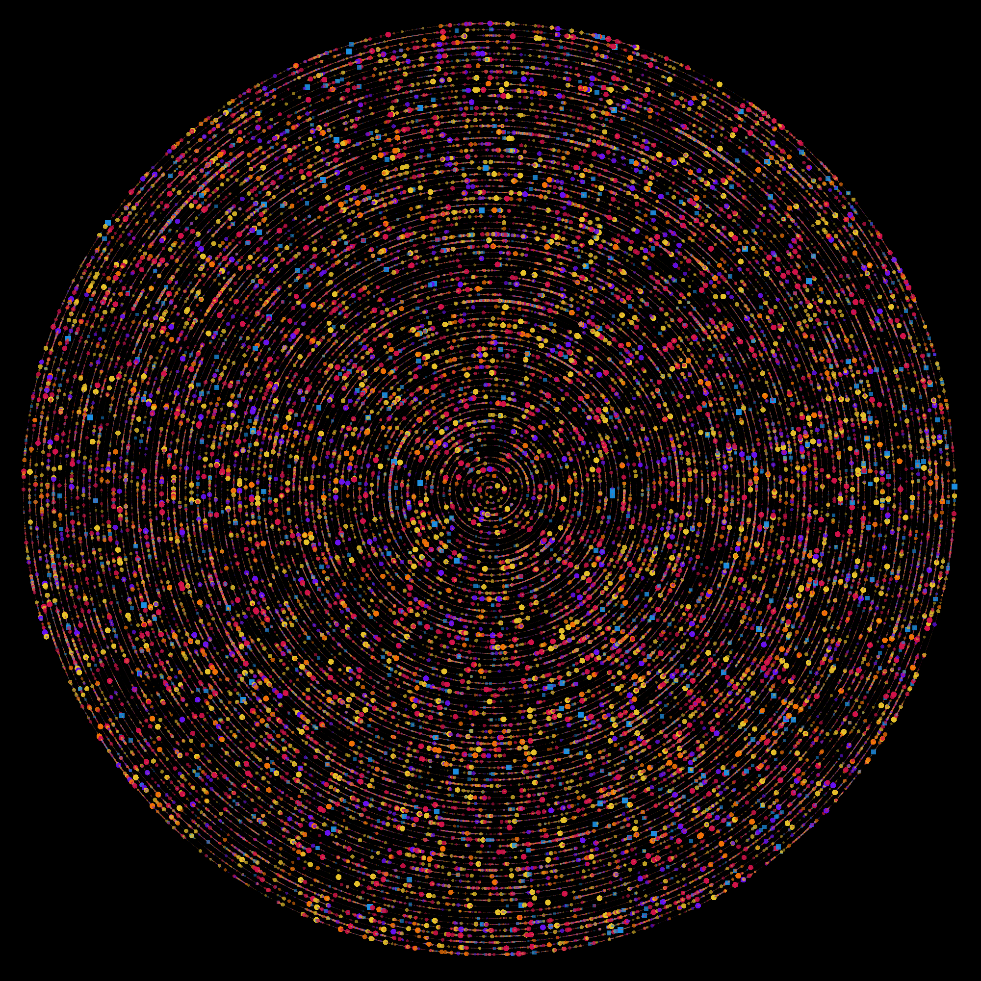
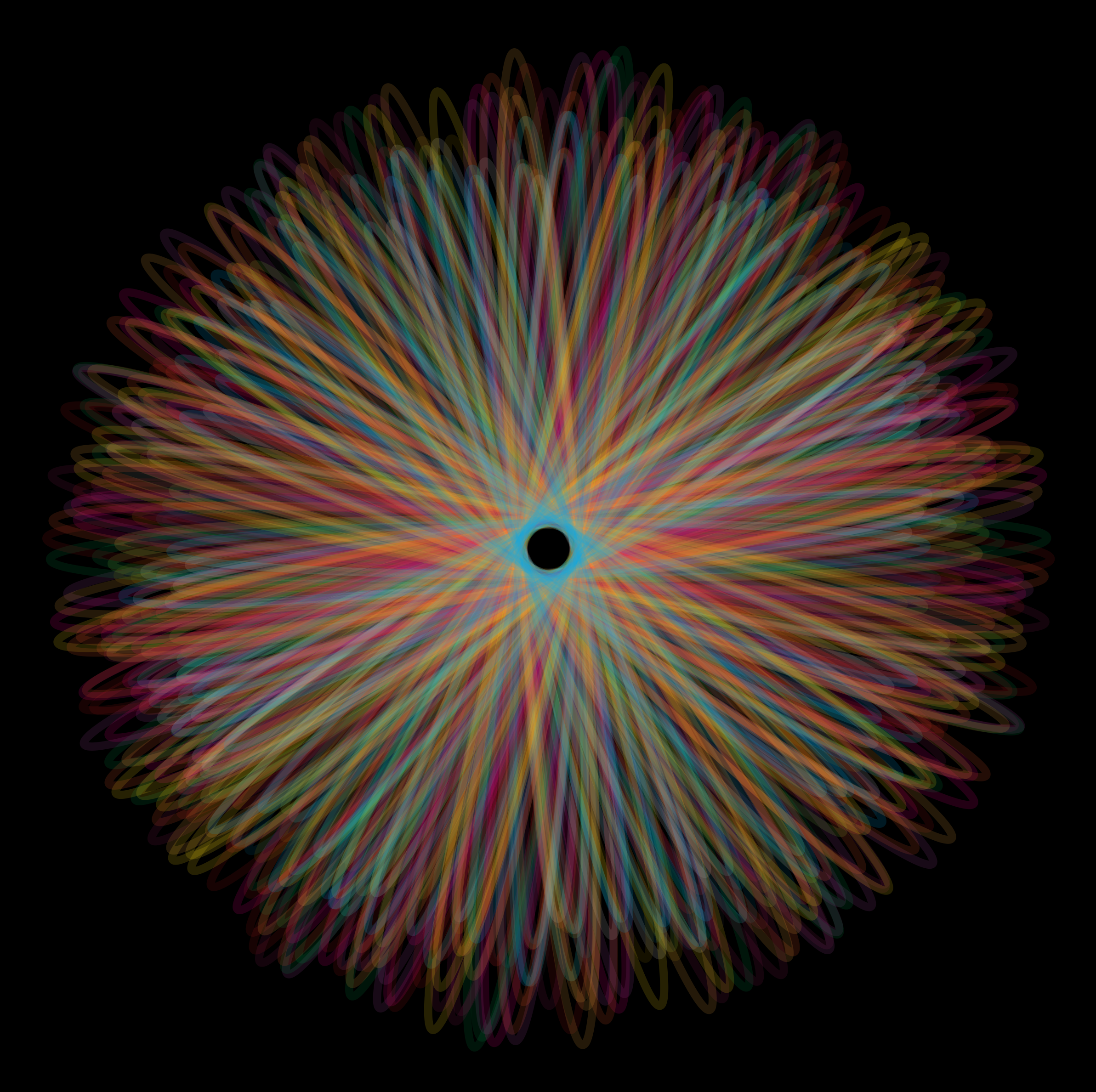
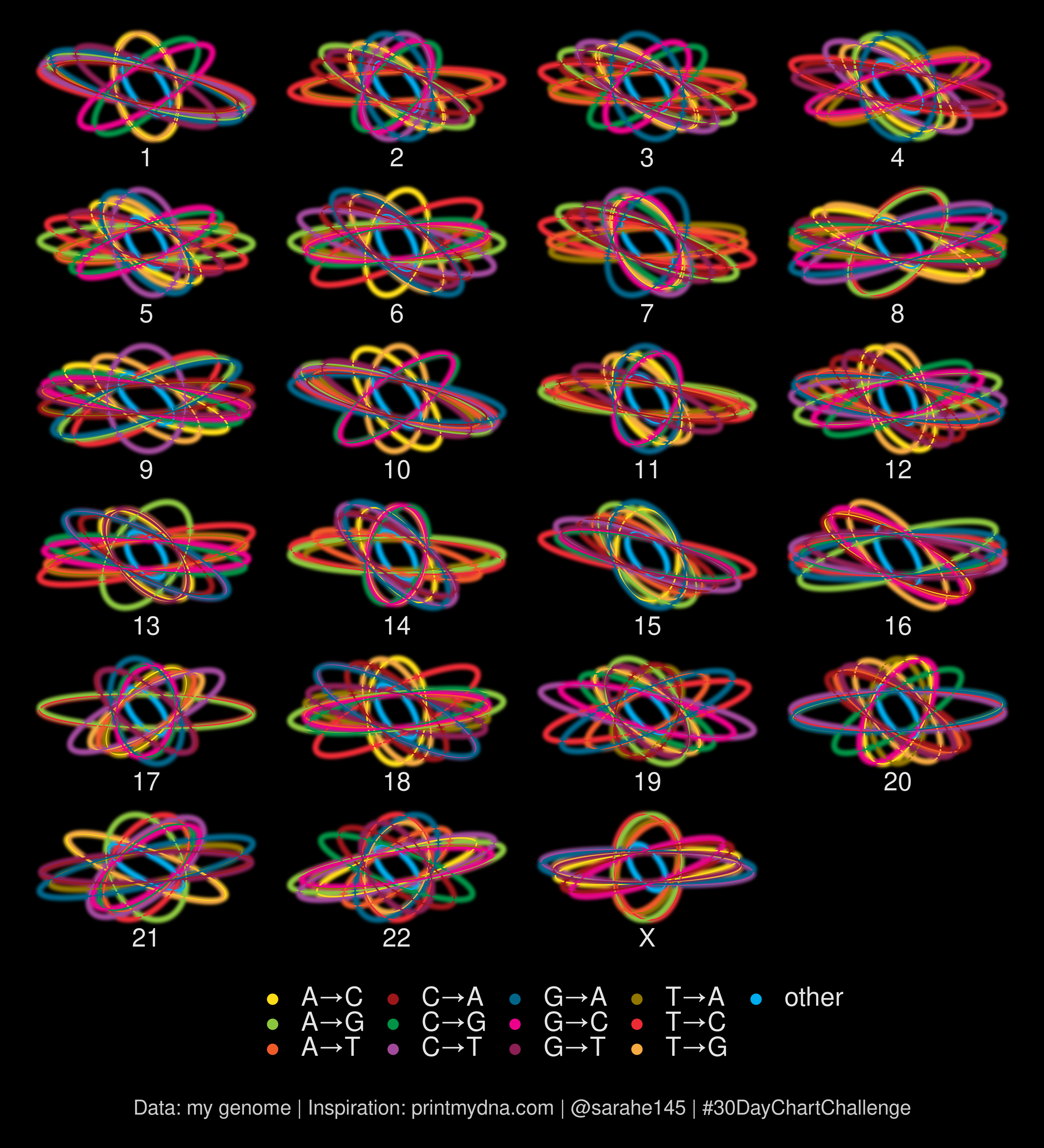
I had my own genome sequenced a few years ago and enjoy making different abstract visualizations of the data. The plots below are generated using my genome sequence data.
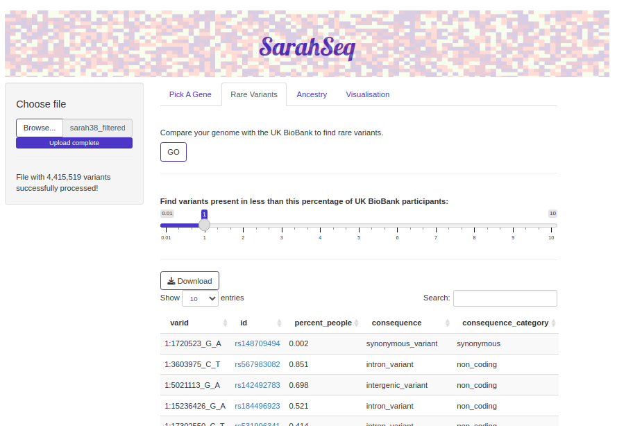
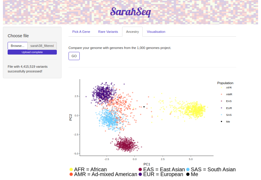
I also developed an R Shiny app (cleverly titled SarahSeq) for exploring and visualizing my genome. The app should work with any VCF file (not just those from people named Sarah).