class: center, middle, inverse, title-slide .title[ # CRT Data Visualisation<br>Workshop ] .subtitle[ ## Day 1 ] .date[ ### July 2025 ] --- background-image: url(imgs/grid.png) background-size: cover ### What to expect .pull-left[ #### Day 1 - Introduction<br> - Tips & Tricks<br> - ggplot2<br> - BYOD ] .pull-right[ #### Day 2 - ggplot2 extensions - Other tools and things you should know about - Data viz challenge - Presentations ] --- class: center, middle background-image: url(imgs/grid.png) background-size: cover # Introductions --- ### Me - Cohort 1 CRT student - Interested in data visualisation - Currently work for a drug discovery startup based in Toronto  --- ### Me - Cohort 1 CRT student - Interested in data visualisation - Currently work for a drug discovery startup based in Toronto  --- ### Me - Cohort 1 CRT student - Interested in data visualisation - Currently work for a drug discovery startup based in Toronto  --- ## Why you should care about data visualisation Find hidden patterns in data .center[  ] --- ## Why you should care about data visualisation Charts change minds .center[  ] --- ## Why you should care about data visualisation Charts change minds .center[  ] --- ## Why you should care about data visualisation Good data viz can save lives .center[  ] --- ## Why you should care about data visualisation Good data viz can save lives .center[  ] --- ## Why you should care about data visualisation Good data viz can save lives .center[  ] --- ## Why you should care about data visualisation Set yourself apart from others .center[  ] --- ## What makes a good plot It depends who you ask... .pull-left[  .center[Edward Tufte] ] .pull-right[ - Influential voice on data visualisation - Coined the terms “chart junk” and “data-ink ratio” - “The number of information carrying (variable) dimensions depicted should not exceed the number of dimensions in the data” ] --- ## What makes a good plot It depends who you ask... .pull-left[ .center[ Florence Nightingale<br> 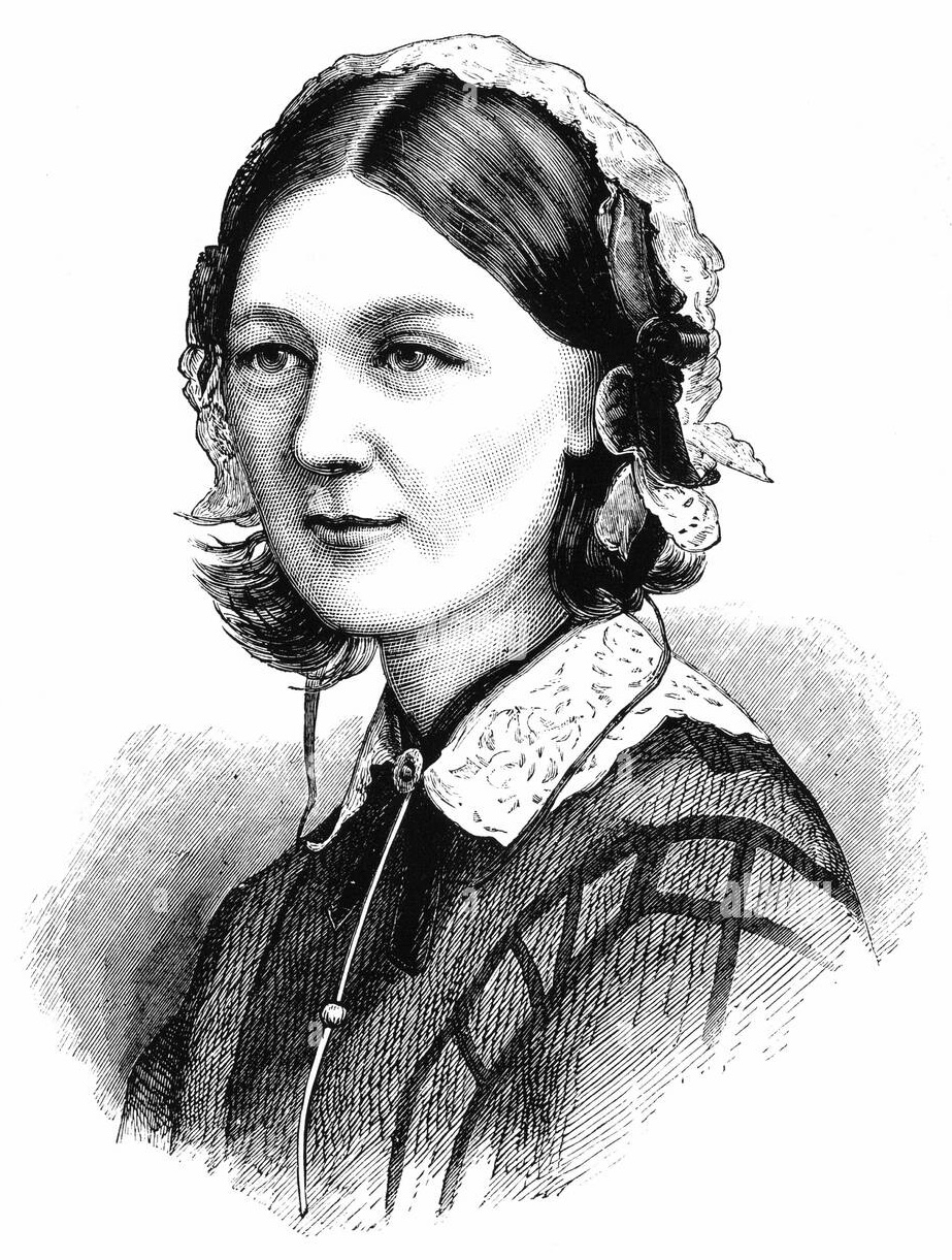<br> Pioneer of colourful, clear visualisations aimed at a popular audience ] ] .pull-right[ 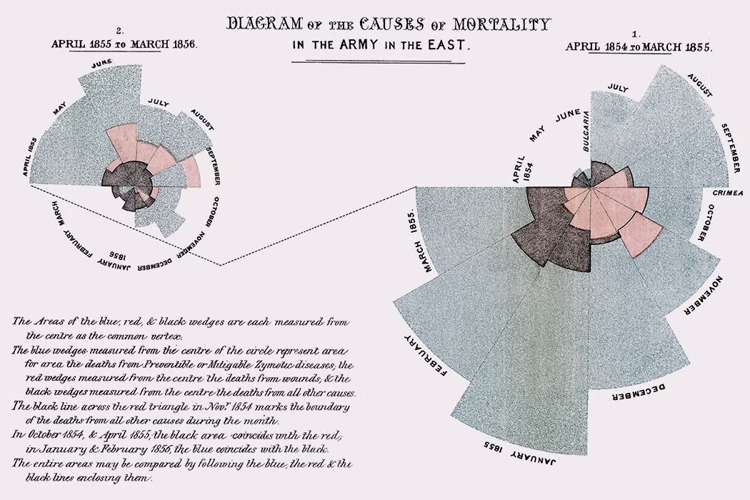 ] --- class: center, middle background-image: url(imgs/grid.png) background-size: cover # Tips & Tricks --- ## Choosing the correct chart type Considerations - What type of data are you working with - distribution or trend in a single variable or a relationship or comparison between multiple variables - What is the audience for the visualisation - lab meeting, conference presentation, thesis/publication - What question do you want the plot to answer -- .center[ <br> *Choose a chart type that will visualise the message you want to convey in the most effective and obvious way* ] --- ## Colour ♥️💙💚💛💜 Palette types .center[  ] --- ## Colour ♥️💙💚💛💜 Colour blindness .center[  ] --- ## Colour ♥️💙💚💛💜 Colour blindness .pull-left[ Quantitative (sequential)  [viridis palettes](https://cran.r-project.org/web/packages/viridis/vignettes/intro-to-viridis.html) ] .pull-right[ Quantitative (diverging)  [Seurat purple yellow](http://satijalab.org/seurat/reference/custompalette) <br><br> Qualitative  [Martin Kryzwinski palettes](https://mk.bcgsc.ca/colorblind/palettes.mhtml) ] --- ## Colour ♥️💙💚💛💜 Colour blindness .pull-left[ Quantitative (sequential)  [viridis palettes](https://cran.r-project.org/web/packages/viridis/vignettes/intro-to-viridis.html) ] .pull-right[ Quantitative (diverging)  [Seurat purple yellow](http://satijalab.org/seurat/reference/custompalette) <br><br> Qualitative  [Martin Kryzwinski palettes](https://mk.bcgsc.ca/colorblind/palettes.mhtml) ] --- ## Colour ♥️💙💚💛💜 Colour blindness .pull-left[ Quantitative (sequential)  [viridis palettes](https://cran.r-project.org/web/packages/viridis/vignettes/intro-to-viridis.html) ] .pull-right[ Quantitative (diverging)  [Seurat purple yellow](http://satijalab.org/seurat/reference/custompalette) <br><br> Qualitative  [Martin Kryzwinski palettes](https://mk.bcgsc.ca/colorblind/palettes.mhtml) ] --- ## Colour ♥️💙💚💛💜 Be consistent<br> <br> [*Horkan et al, 2025*](https://www.nature.com/articles/s41467-025-57168-z) --- ## Colour ♥️💙💚💛💜 Be consistent... but not like this...  --- ## Ordering variables .center[  ] --- ## Ordering variables .center[  ] --- ## Avoid rotated labels .center[  ] --- ## Use annotations and labels  [*Stokes et al, 2022*](https://arxiv.org/abs/2208.01780) --  --- ## Themes .left-code[ ``` r library(ggplot2) library(palmerpenguins) data(package = 'palmerpenguins') ggplot(penguins, aes(x = bill_length_mm, y = bill_depth_mm, col = sex)) + geom_point() + facet_wrap(~species) ``` ] .right-plot[ <img src="day1_files/figure-html/theme-out-1.png" width="100%" /> ] --- ## Themes .left-code[ ``` r library(ggplot2) library(palmerpenguins) data(package = 'palmerpenguins') ggplot(penguins, aes(x = bill_length_mm, y = bill_depth_mm, col = sex)) + geom_point() + facet_wrap(~species) + * theme_minimal(base_size = 14) ``` ] .right-plot[ <img src="day1_files/figure-html/theme1-out-1.png" width="100%" /> ] --- ## Themes .left-code[ ``` r library(ggplot2) library(palmerpenguins) data(package = 'palmerpenguins') ggplot(penguins, aes(x = bill_length_mm, y = bill_depth_mm, col = sex)) + geom_point() + facet_wrap(~species) + * theme_bough() ``` ] .right-plot[ <img src="day1_files/figure-html/theme2-out-1.png" width="100%" /> ] --- ## Interactivity and animation .pull-left[ - Plots don’t have to be static - Consider animations for presentations - Link to interactive apps in your publications/thesis ] .pull-right[  ] --- class: center, middle background-image: url(imgs/grid.png) background-size: cover # ggplot2 --- ## ggplot2 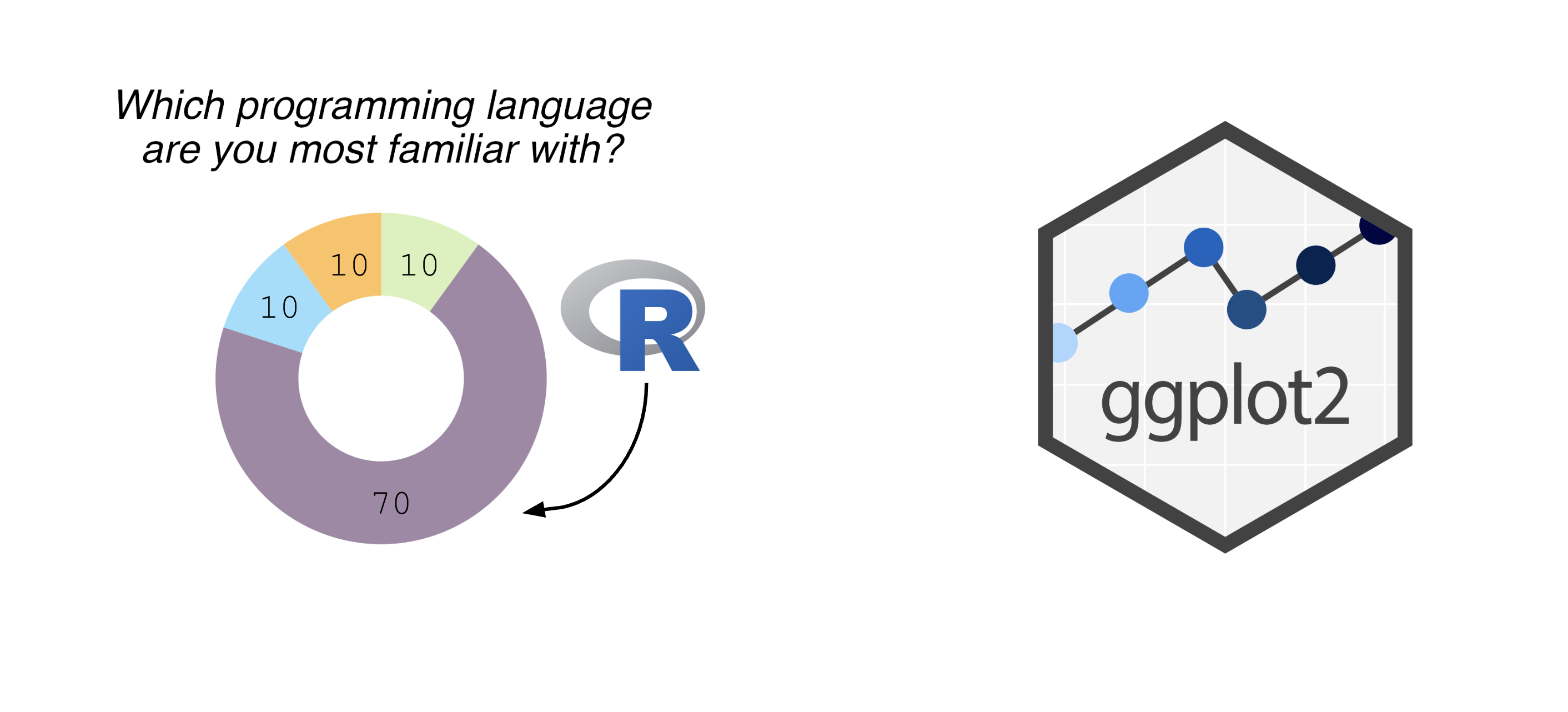 --- ## The grammar of graphics .pull-left[ - Language proposed by Leland Wilkinson in 2005 - Foundation for building almost any type of plot - Plots are built up in sequential layers - Implemented in ggplot2 package as well as other packages ] .pull-right[ 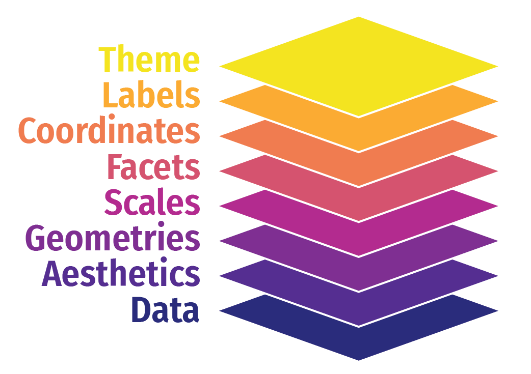 ] --- ## The anatomy of a ggplot .left-code[ ``` r ggplot(data = mpg, aes(x = hwy, y = displ, colour = class)) ``` ] .right-plot[ <img src="day1_files/figure-html/gg1-out-1.png" width="100%" /> ] --- ## The anatomy of a ggplot .left-code[ ``` r ggplot(data = mpg, aes(x = hwy, y = displ, colour = class)) + geom_point() ``` ] .right-plot[ <img src="day1_files/figure-html/gg2-out-1.png" width="100%" /> ] --- ## The anatomy of a ggplot .left-code[ ``` r ggplot(data = mpg, aes(x = hwy, y = displ, colour = class)) + geom_point() + scale_colour_manual(values = rainbow(7)) ``` ] .right-plot[ <img src="day1_files/figure-html/gg3-out-1.png" width="100%" /> ] --- ## The anatomy of a ggplot .left-code[ ``` r ggplot(data = mpg, aes(x = hwy, y = displ, colour = class)) + geom_point() + scale_colour_manual(values = rainbow(7)) + labs(x = 'Highway miles per gallon', y = 'Engine displacement (litres)') ``` ] .right-plot[ <img src="day1_files/figure-html/gg4-out-1.png" width="100%" /> ] --- ## The anatomy of a ggplot .left-code[ ``` r ggplot(data = mpg, aes(x = hwy, y = displ, colour = class)) + geom_point() + scale_colour_manual(values = rainbow(7)) + labs(x = 'Highway miles per gallon', y = 'Engine displacement (litres)') + theme_linedraw(base_size = 12) ``` ] .right-plot[ <img src="day1_files/figure-html/gg5-out-1.png" width="100%" /> ] --- ## A more relevant example How to get from this...  --- ## A more relevant example To this...  --- ## Basic plot ``` r marker_df <- read.csv('https://raw.githubusercontent.com/Sarah145/CRT-data-viz/refs/heads/main/data/bm_marker_genes.csv') ggplot(marker_df, aes(x = gene, y = celltype, colour = scaled_avg_exp, size = per_exp)) + geom_point() + theme(axis.text.x = element_text(angle = 90, hjust = 1, vjust = 0.5)) ``` <img src="day1_files/figure-html/unnamed-chunk-1-1.png" width="100%" /> --- ## Enhanced plot Setup... ``` r library(ggtext) gene_order <- c('SDC1','MME','CD19','CD79A','MS4A1','KIT','CD34','CLC','GYPA','PPBP','ITGA2B','CD33','MPO','CTSG','AZU1','LYZ','S100A8','S100A9','CD14','ITGAM','FCGR3A','FCER1G','FCER1A','CLEC10A','IL3RA','IRF8','CD4','IL7R','CD3E','CCR7','CD8A','CCL5','GNLY','KLRB1','NKG7','CXCL12','VCAM1') celltype_cols <- c(Plasma="#333333", CLP="#B2EF9B", Pre.B="#3A7219", B="#1B360C", HSC.MPP="#F7D760", MEP="#B84F09", Late.Eryth="#6D2F05", Megakaryocytes="#F7A660", GMP="#DE9197", CD14.Mono="#AD343E", CD16.Mono="#BD0000", cDC="#FF0378", pDC="#FC5E03", CD4.N="#015073",CD4.M="#96CBFE", CD8.N="#16B8B2", CD8.M="#946CD5", NK="#4D1282", Mesenchymal="#702127") gradient_cols <- colorRampPalette(c('#190C3E', '#87216B', '#E55C30', '#F7D340')) y_labs <- paste0("<span style='color:", celltype_cols, "'>", names(celltype_cols), "</span>") head(y_labs) ``` ``` ## [1] "<span style='color:#333333'>Plasma</span>" ## [2] "<span style='color:#B2EF9B'>CLP</span>" ## [3] "<span style='color:#3A7219'>Pre.B</span>" ## [4] "<span style='color:#1B360C'>B</span>" ## [5] "<span style='color:#F7D760'>HSC.MPP</span>" ## [6] "<span style='color:#B84F09'>MEP</span>" ``` --- ## Enhanced plot ``` r ggplot(marker_df, aes(x = gene, y = celltype, colour = scaled_avg_exp, size = per_exp)) + geom_point() + scale_x_discrete(limits = gene_order) + scale_y_discrete(limits = rev(names(celltype_cols)), labels = rev(y_labs)) + scale_colour_gradientn(colours = gradient_cols(100)) + scale_size(labels = scales::percent, range = c(0.5, 4)) + labs(x = NULL, y = NULL, colour = 'Avg. expression\n(scaled 0-1)', size = '% cells\nexpressing\ngene') + guides(colour = guide_colourbar(order = 1, barlength = unit(6, 'lines')), size = guide_legend(order = 2)) + theme_linedraw(base_size = 14) + theme(axis.text.x = element_text(angle = 90, hjust = 1, vjust = 0.5), axis.text.y = element_markdown(face = 'bold'), legend.title = element_text(size = 12, vjust = 0.5), legend.box.margin = margin(t = 45)) ``` <img src="day1_files/figure-html/unnamed-chunk-3-1.png" width="100%" /> --- class: center, middle background-image: url(imgs/grid.png) background-size: cover # BYOD